
Client: Electronic Arts
It is is quite unusual, as a designer, to be allowed to show the design process and show the designs which didn’t make it, but thanks to Speedhunters, I’m able to share some of the behind the scenes work on the Team Need for Speed livery design.
I started sketching some ideas for the Team Need for Speed livery on the last day of 2009. Rod and Patrick had introduced me to the Team Need for Speed concept and it was my task to create a livery which would work in multiple arenas. Not an easy task, on one hand it was a great opportunity, but the on other hand it was ‘how the hell am I going to pull that off!’
I have been very fortunate and have designed hundreds of liveries in my time, around 60 have seen the light of day. Many stay inside unsuccessful sponsorship proposals which teams and drivers had presented. This was probably the hardest design to work on…. well there was this Panoz livery once…..<snip>
We knew early on, Team Need for Speed would make its debut in GT racing and Drifting. Two diverse disciplines. In order for the livery to work and be recognizable as a Team Need for Speed identity it had to have a strong graphic which set itself apart from other cars on the grid.
The livery had to work in both arenas, which was an additional challenge.
While its relatively easy to design a corporate livery with a strong identity, we didn’t want it to be too corporate. We are a video game maker after all.
So, a iconic livery which is instantly recongisable on multiple cars, but not corporate….ahhhh
If I’m honest, my liveries are quite clean and corporate. This was not the route to take, although as you can see, the initial designs I’m showing here do take that route. I didn’t realize until I looked back at these for this article, but I was already starting to use diagonal cuts from the logo on the first batch of designs.
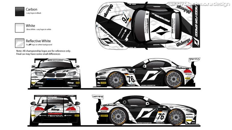
The Need for Speed logo is a ‘N’ with a tach needle through it. The logo had to play a significant role in the design as ‘Need for Speed’ is quite a lot to read at 150mph!
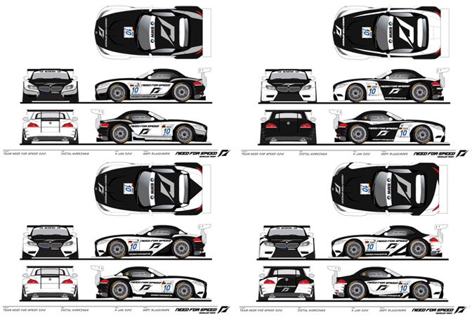
As we progress through the designs I start to use the bodylines of the car more. It’s a good trick which gives a clean livery, but in reality, this wouldn’t work so well on other cars, so back to the drawing board,,,or in this case, the tablet.
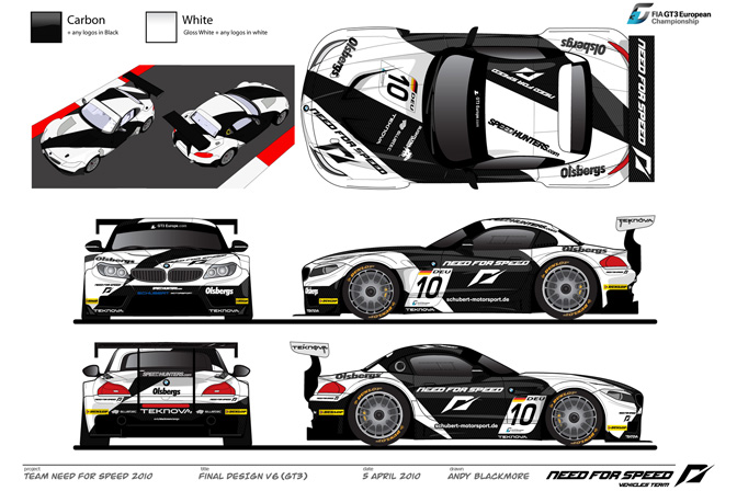
This design marks a significant milestone in the process. Here, I’m starting to use the ‘N’ graphic as part of the main design. As its italicized, it not the easiest logo to work with . It will fit on one side and look like its flowing with the car, but not on the other!
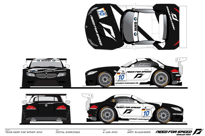
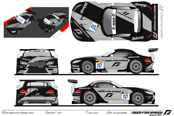
Meanwhile, this more conventional design was developed over time and was one of the final two. It is a clean design and would work on different cars, but it is a little safe. More in keeping with a GT car. I always like to try and include the number panel in the design if possible, hence the white band across the hood and fenders.
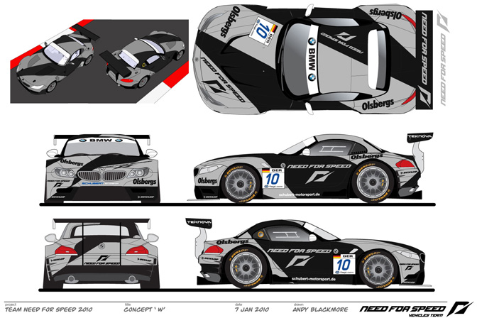
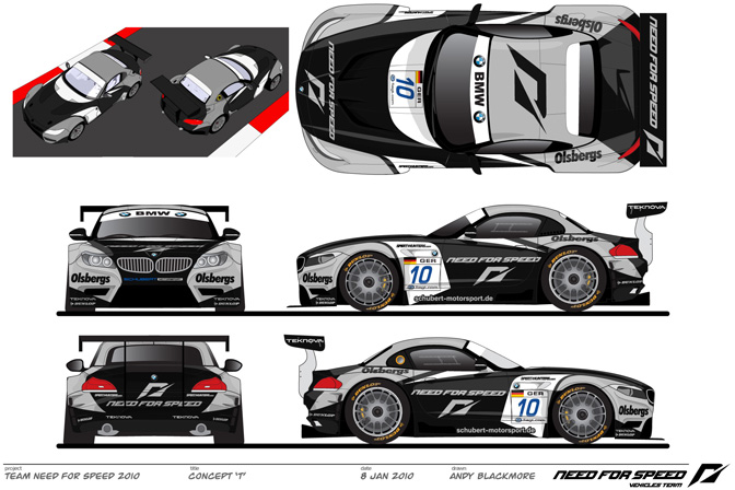
I kept playing with the N graphic and then hit upon the idea of scaling the logo up so it drapes the whole car. This allowed me to replicate part of the Need for Speed logo in front and rear views….
I used some artistic license to close the graphic up front and rear as you can see above. This is a key feature of the logo where the different angles meet and would become the key element of the design.
Interesting, the ‘N’ doesn’t read well when the colours were reversed.
We now had a base design, but I still hadn’t seen the final car and I have learned the hard way, never to sign off on a design until you can see a final car!
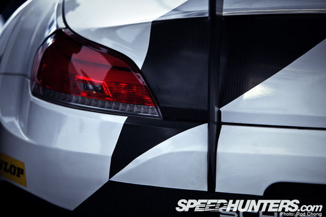
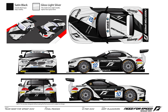
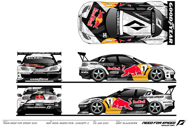
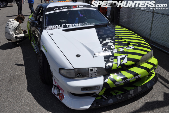
In mid February, we saw the first shots of the still-secret car. As few changes were required in the bumper areas, which enhanced the livery. You will also note we were looking at using a very light Silver. This was hard to source quickly, so we reverted to White vinyl, having used this on Mad Mike’s car. It was a good decision! The livery is much more distinctive with more contrast.
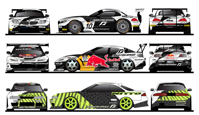
We had ensured the livery would be unique and distinctive, thanks to its asymmetric designs, but we still wanted to ensure each driver and car had its own personalization……
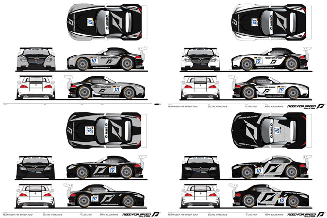
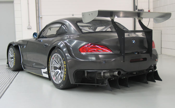
As time passed, Patrick informed us, the car would be delivered in raw Carbon. We thought it would be cool to keep this, rather than the original plan of painting it Satin Black. We wanted Individuality on each of the cars (to get away from that corporate cookie cutter look), and this was the perfect material to showcase the all-new BMW Z4 GT3 race car off.
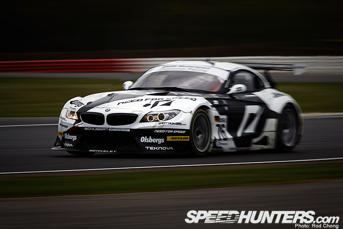
The first chassis went testing and took part in a VLN race in early April and was vinyled in Silver.
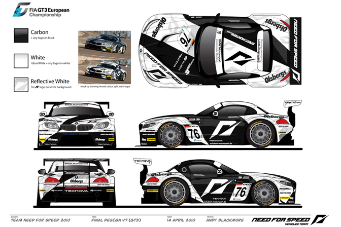
It didn’t punch enough, so we ensured the final cars would remain White. We also took the opportunity to revise the branding to emphasis the Need for Speed ‘N’.
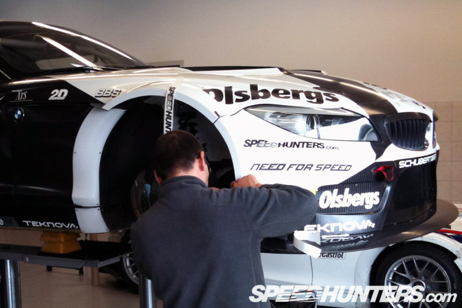
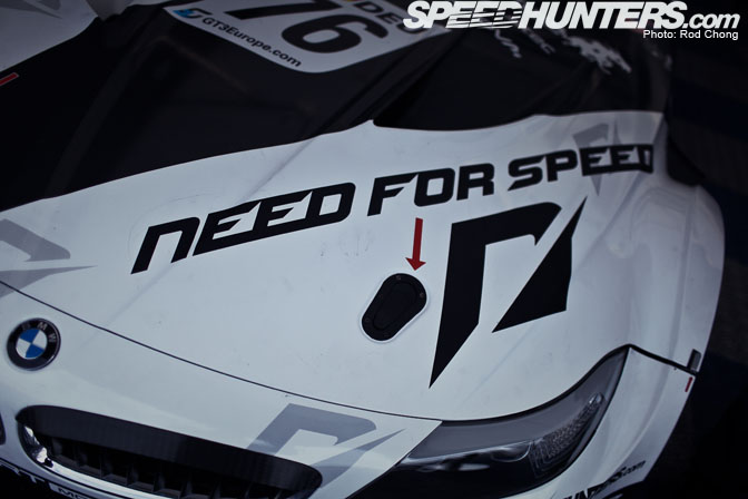
Unfortunately the car suffered race damage and needed to go back to BMW for repairs, leaving Schubert and their vinyl guys very little time to apply the new livery, but they nailed it!
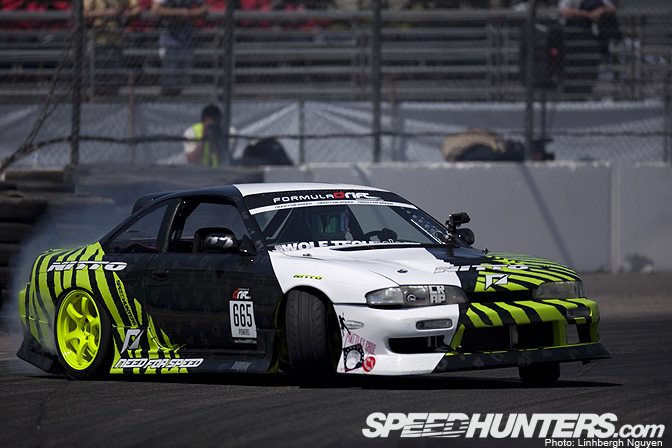
The car came out very well and the latest addition of reflective ‘N’s worked well.
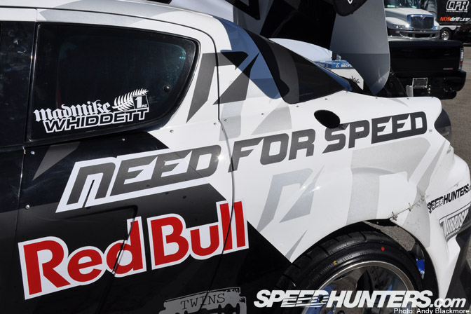
The reflective ‘N’s were an idea which came from Mad Mike Whidett. As Speedhunters will know, Mike has long been associated with Red Bull and Camo livery.
When we initially started talking with Mike, the basic concept of the BMW livery had been locked, so we started applying that on the RX8. Mike already had sponsorship with Red Bull, so it was interesting to try and marry up the two brands. A good test for the future.

It was great working with Mike as he produces vinyls and graphics and has a great eye for designs and what is achievable with vinyl.
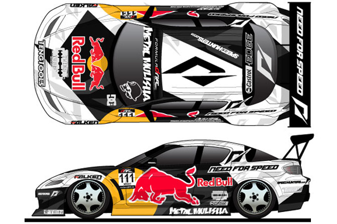
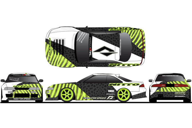
The design didn’t really change much over time, but the Camo came and went, replaced by ‘N’s to the black areas and finally the white sections.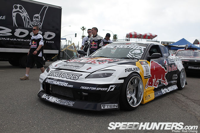
In the end Mike went with N’s all over the car which works really well.
Matt Powers is our third announced program for Need for Speed at this present time (ummm, what does that mean….. stay tuned! ). We wanted to keep the Team Need for Speed identity, but it was vital for Matt and ‘Mattley Crew’ to have their own personalization on this.
Luckily, Matt and his crew came up with a variation to the Team Need for Speed design which worked well and fitted in perfectly with his look. You can’t miss it!
This view shows how the Team NFS graphic is retained, but personalised.
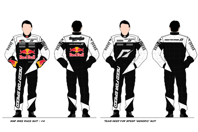
I also had the opportunity to design Mike’s race suit for Formula Drift. We came up with a design which works well for his use and future usage as a generic Need for Speed design. The FIA GT3 series stipulates a specific uniform design so we couldn’t go that route.
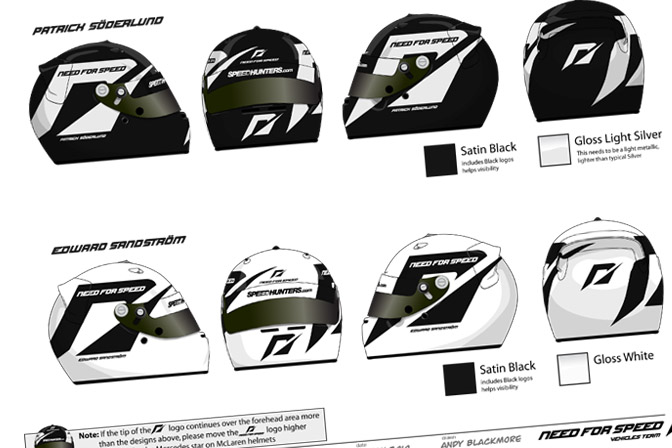
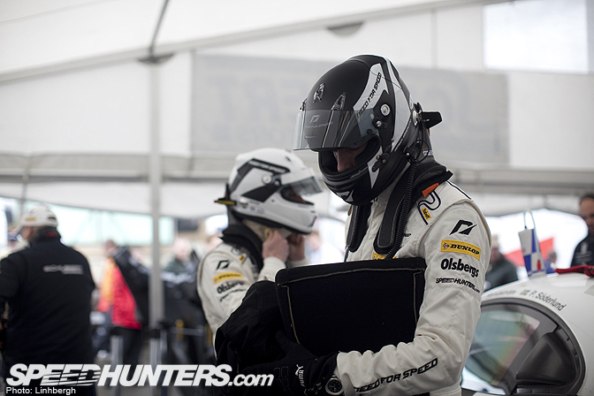
I also offered up a design for Patrick and Edwards Crash helmets. I didn’t spend very long on these at all, quite a rush job, but they come out really well and I think I’m going to get my lid redone like this now ![]()
So, that’s the background to the race-car livery design. In the end it was a great project to work on and one of the highlights of my career here at EA.
-Andy Blackmore
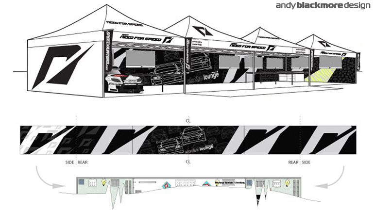
Following on from the article, I also designed the interior of the Electro Lounge, a Paddock area at Formula Drift which housed race cars, DJ, gaming area and seats.
This was very popular and first time a VIP area had been used in the paddock.
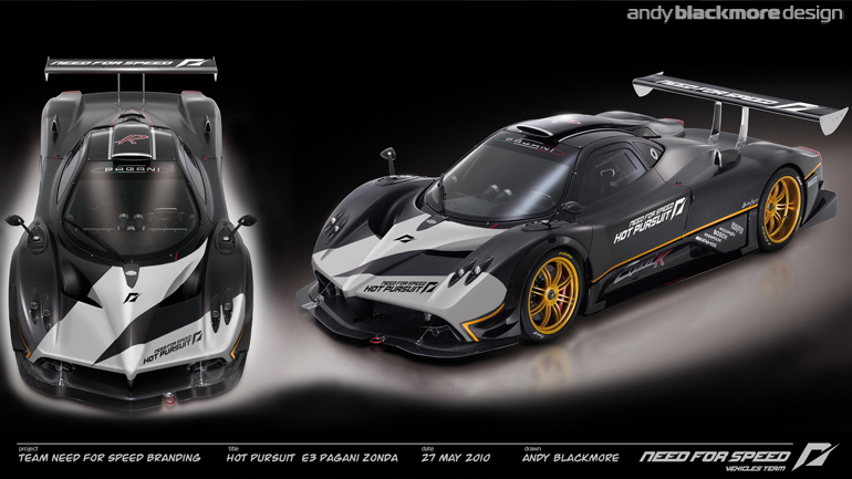
I also had the opportunity to design one-off show car liveries such as this Pagani Zonda for E3
Part Two of the Team Need for Speed Story can be read here.