
Client: Vancouver Canucks
The Vancouver Canucks recently commissioned me to produce a livery for one of their new Toyota Tundra trucks. I have known Mark Raham, Creative Director at the Canucks for years having worked with him in my days on the Need for Speed video game.
Mark reached out to me as they wanted something striking and unique to showcase their new relationship with Toyota and promote their ‘#PlayForThis’ campaign.
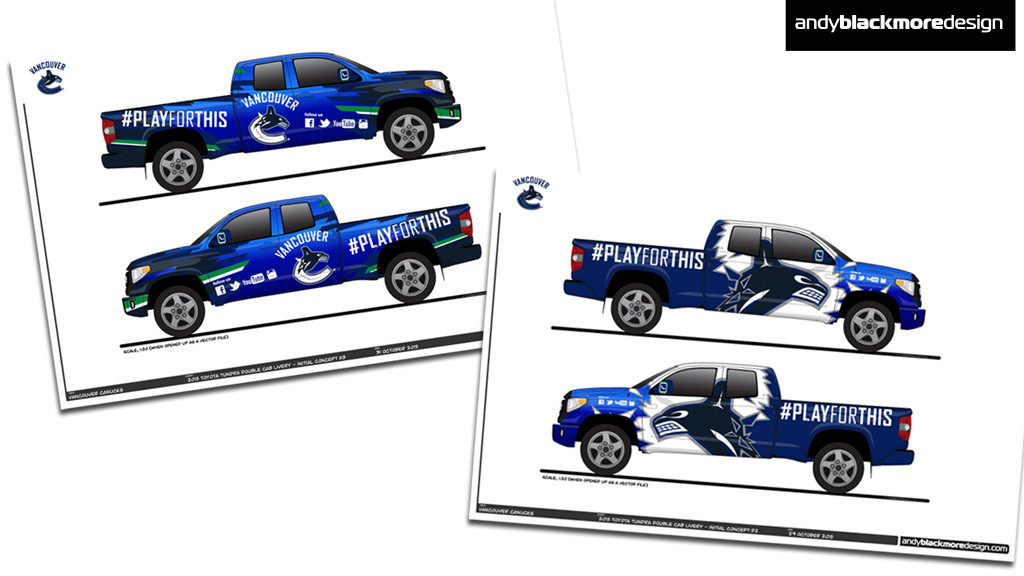
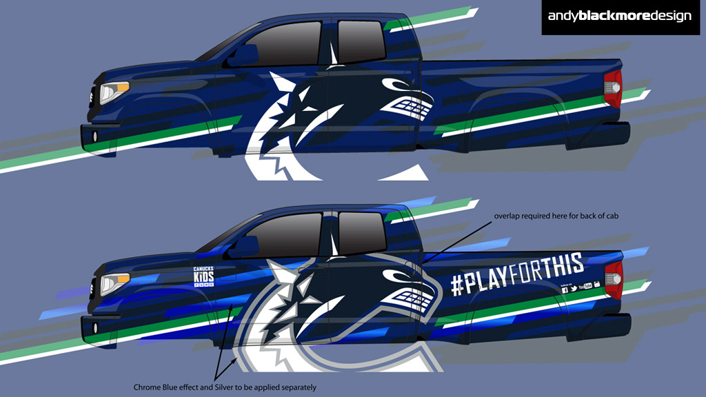
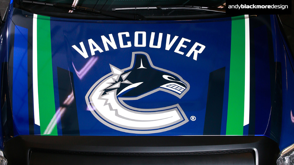
Initial concepts included extensive use of chrome or metallic blue as shown above, biut we decided to keep to the house colours and use the chrome as an accent. Working directly with Mark to form, we centered on a concept which uses small sections of the traditional White and Green stripe which usually uns around the bottom of the team shirts as small flashes across the truck, mixed with various blue hues.
This was angled to give it a more dynamic look often seen on race cars.
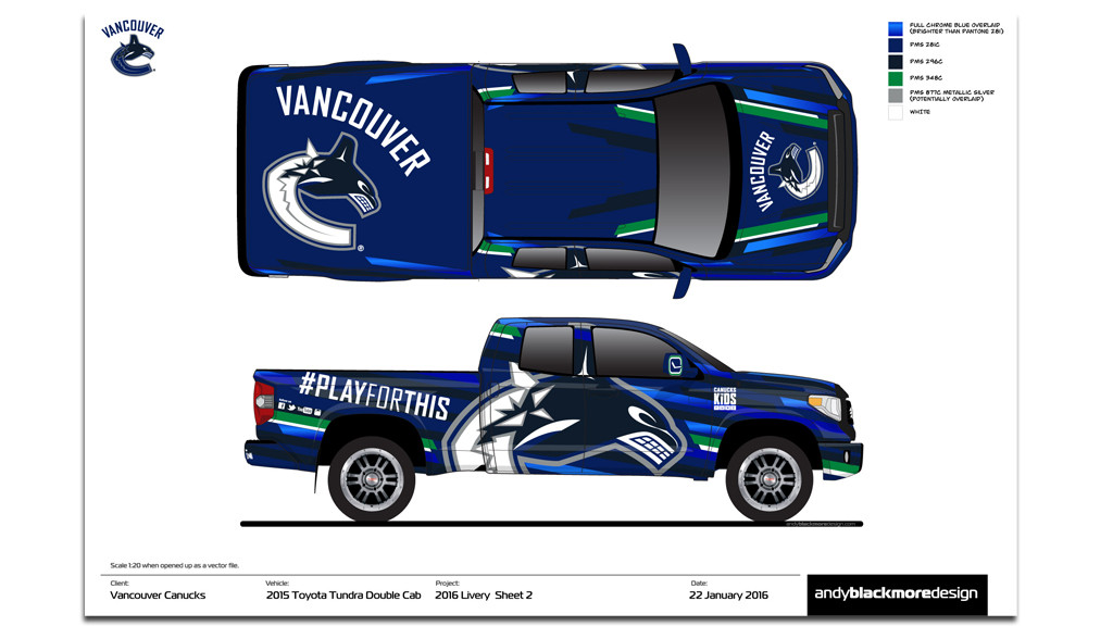
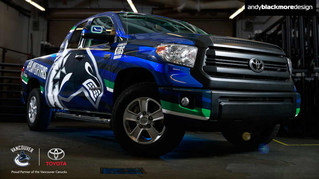
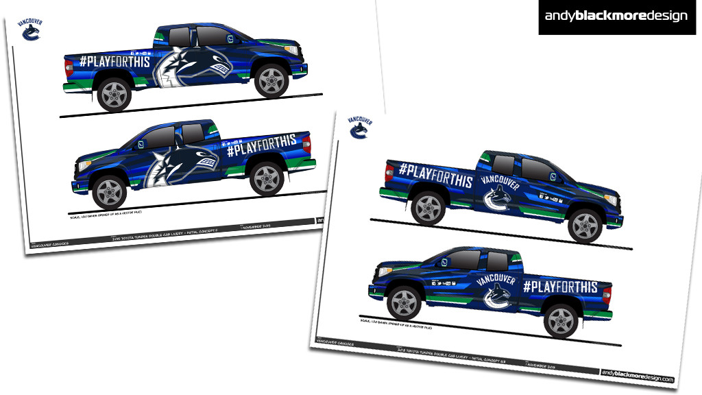
The centerpiece of the design was a huge Canucks logo on the side. This logo is not symetrical due to the shape of the C and the position of the Orca, so placement, even though cropped was critical.
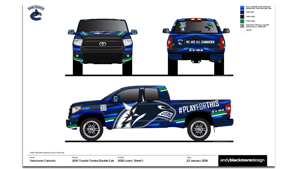
If you look carefully, these are in slightly different positions and angles on each size to use the ‘canvas’ of the B-pillar.
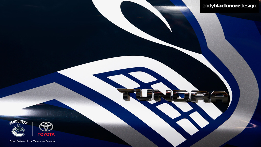
We also introduced a semi-chrome effect blue accent strip into the design. I partnered with regular client AERO Paint film who supplied some of their ‘Liquid Metal Cobalt Blue’P aint film (noe, this is not a vinyl) for these accents.
(Race fans – this is the blue often used by Michael Shank Racing).
The final design was wrapped by local company 37Inc, who I recommended to the Canucks after their great attention to detail on the HPA Motorsports wrap.
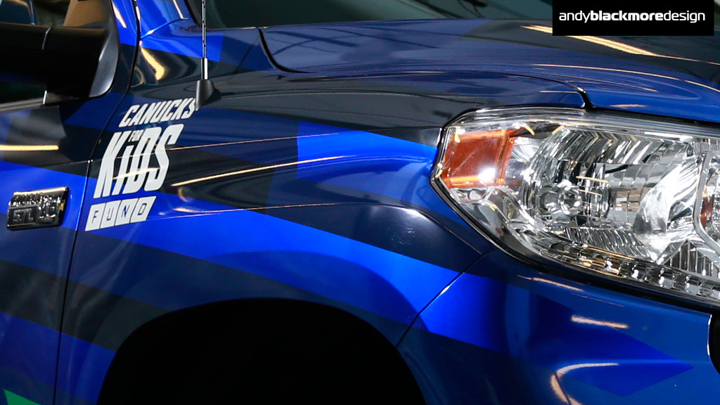
The wrap was a little more complicated than usual as visual impact was key. The basic design was screenprinted, but the silver and the aforementioned cobalt blue were added in afterwards.
You could screen print these colours, but thats just a compromise.
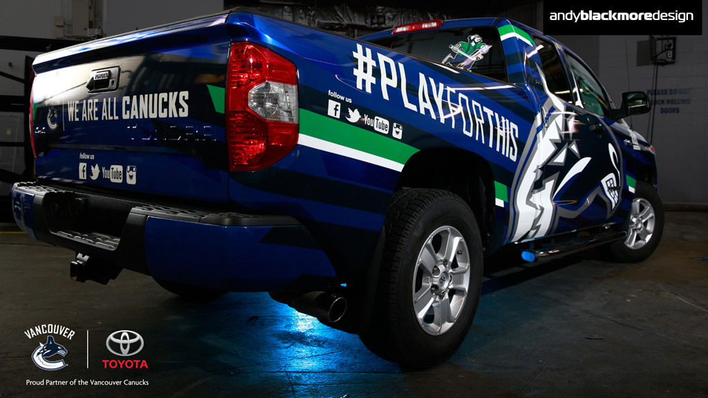
Some of the white branding was also overlaid separately in reflective white as this truck will be touring the streets of Vancouver or on show on game nights outside Rogers Arena.
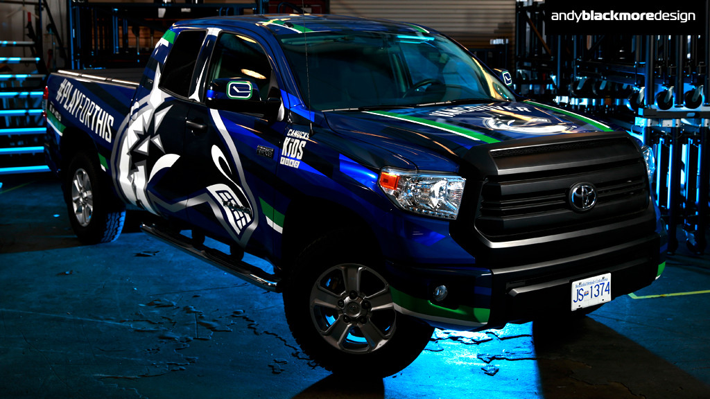
Final touches includes social media call outs and the iconic ‘Stick-in-Rink’ logo which the Canucks carry on the upper arms. This worked perfectly on the mirrors.
Finally, the front grille was wrapped in a satin black to give it a more aggressive look.
Most of my projects are for race teams around the world, so it was a awesome experience to work on a local project, even better to branch out from motor racing and to a sport which dominates my local city.
I couldn’t resist popping down to 37Inc once they started wrapping to see this one come to life. They did a great job.
I am really pleased with the look of the new truck and seen it around a few times already. The Canucks obviously like it as I now have a new project for a new vehicle, more soon!
Useful links:
Vancouver Canucks
37 Inc
AERO